Here are some case studies of WordPress websites we’ve built for happy clients.
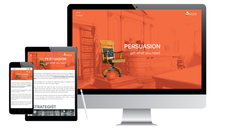
Juliet Huck, Persuasion Strategist
Challenges
Fix
Result
This was an unusual website project. The client was launching a podcast. She wasn’t ready for a full website but wanted a landing page.
So that’s where we started. Incorporating the client’s artwork (she’s a graphic designer), we built a WordPress site which consisted of landing and contact pages.
The landing page spotlights Juliet’s podcasts (she’s done more than 40 to date) which are hosted on the website. We’ve added Spotify and Apple Music buttons for streaming and most recently created a page for meditations that she’s created which can be purchased on the site. And yes, there’s now a home page which features Juliet’s books, some of the notable clients she’s worked with and just enough bio info.
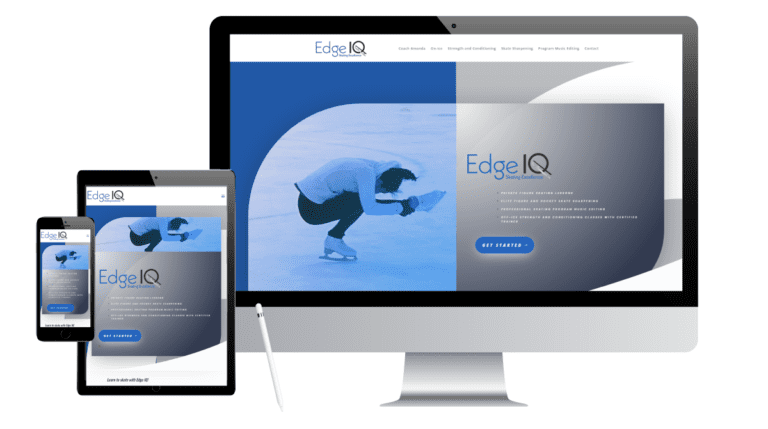
Edge IQ Skating
Challenges
Fix
Result
Entrepreneur and professional skating coach Amanda Kunze needed a professional website for her new business but – like a lot of startups — didn’t have the budget for a custom site.
We customized a WordPress template, saving her a considerable amount of design
and build cost. We also did some copy editing and SEO. Prior to building the
website, Iris designed a logo which was created in various formats for brand
building and development. The look of the logo drove the website design.
The new site does everything Amanda needs it to do and presents her extensive
skills and experience in a sleek polished format.
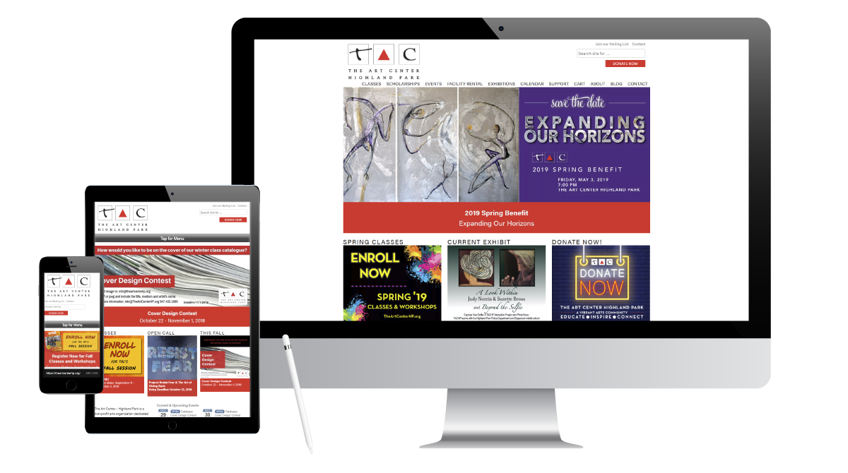
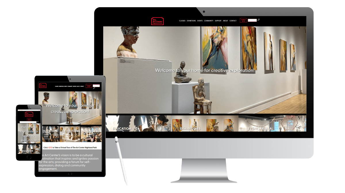
The Art Center Highland Park
Before
After
Challenges
Fix
Result
We’ve done two redesigns for The Art Center – one in 2015 and another, most recently, in 2021.
The first redesign focused on replacing a complex process of loading e-commerce data which made updating events and classes a nightmare for the staff. We built a WordPress site that used spreadsheets to simplify the task. We also streamlined the clunky design with a fresh new look.
Redesign #2 A rebranding reflected a broader focus geographically as well as expanded programming – moving beyond visual arts to include performing arts. A prior emphasis on classes now needed to include exhibits and programming.
Working closely with the client (they are artists), we gave the website a sleek, clean, modern new look. We replaced a dated slider on the home page with a WOW! hero image for visual impact and removed an interior page sidebar to open up the width of each page.
We also gave the staff detailed instructions on how to add content and images to retain the clean design.
TAC’s new WordPress website not only meets their visual expectations but is super easy for them to update.
A streamlined scheduling process allows site visitors to quickly find and sign up for classes using various criteria (UX). You can also easily find and register for events.
Artists can easily see how to submit work for the exhibits. We also made it easy to donate, which is especially crucial for arts organizations struggling right now.
The Sullivan Firm Ltd
Before
After
Challenges
Fix
Result
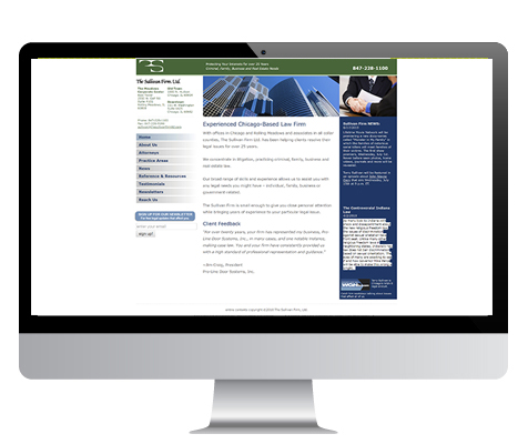
The original Sullivan Firm website was built in 2009 on a proprietary platform. Nine years later, the site was sorely dated and in need of a redesign. Complicating matters, the original developer was no longer reachable, making updates impossible.
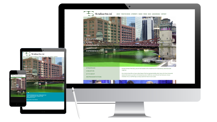
We built an easy-to-update, scrollable website on the WordPress platform. It features a fresh clean look with large Chicago-themed images, including a “green river” home page picture (Terry Sullivan’s request. He’s all Irish!). The client provided hand-drawn courtroom sketches that lend visual interest while alluding to Terry’s involvement in key trials.
A bright modern new website highlights the firm’s key practice areas while a new blog and videos spotlight Terry’s involvement in the legal community. (He’s been the WGN-TV legal analyst for the past 20 years.) Fast-loading, responsive, SSL-secure and user-friendly, the site makes it easy for visitors to quickly learn about this law practice.
Flanigan Communications
Before
After
Challenges
Fix
Result
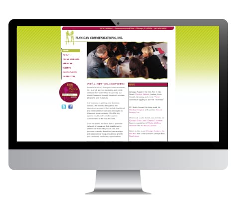
Dyana had a fresh new logo (Iris-designed). Now she needed to replace a woefully dated website. She also wanted to start blogging.
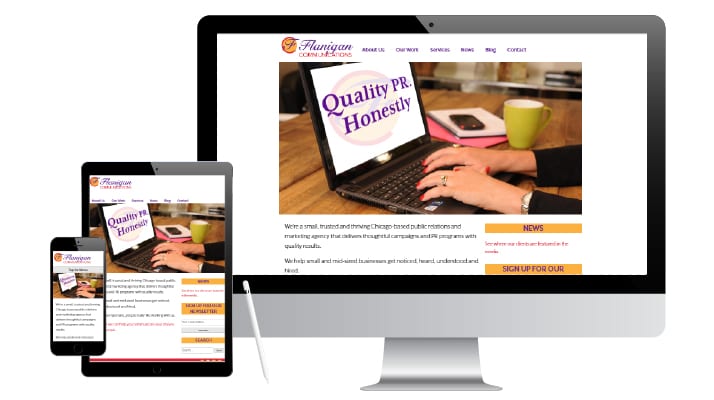
In PR, showing client media placements is important. So we made it easy to find with a News jump link in a sidebar on the homepage, as well as in the top menu bar. A newsletter signup bar is also in the sidebar to capture interested readers. The Case Studies page lets you quickly scroll or click on Show More to read details about specific projects.
The vibrant, contemporary site reinforces Dyana’s brand. Visitors don’t have to dig around to see how she can help them. The Services page clearly details her areas of expertise and explains her PR process.
Dyana loves being able to easily update her blog….aptly entitled Dyalogue.