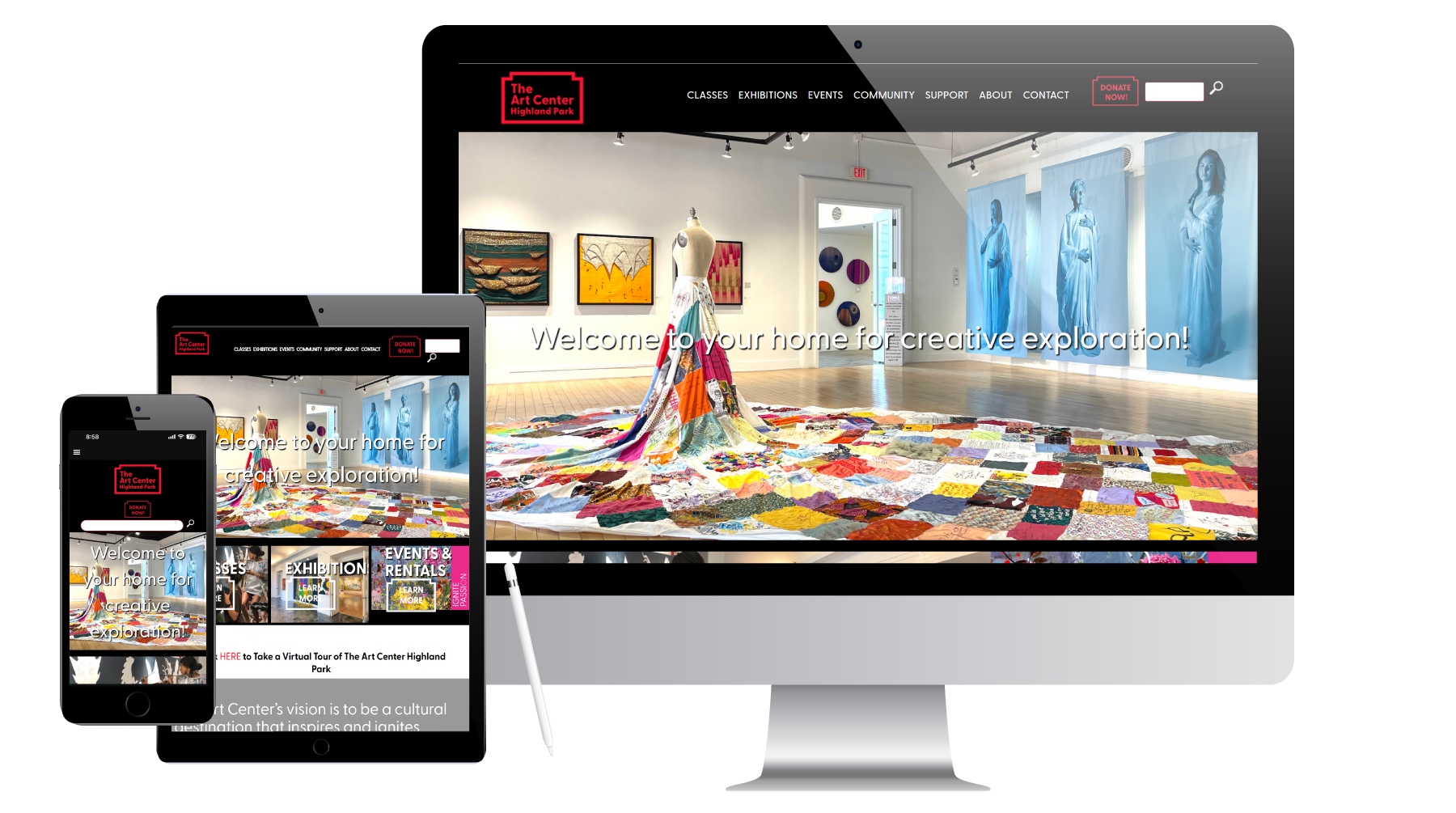
A rebranding changed the look of the logo, reflecting a broader focus as well as expanded programming – moving beyond visual arts to include performing arts. A prior emphasis on classes was enhanced to focus on exhibits and programming.
The old website had a lot of wasted space and not as much visual impact as we wanted. The new site, informed by the new brand is sleek, clean and modern. Images were enlarged for greater impact. An interior page sidebar was removed opening up the width of each page. Ease of navigation makes it a cinch for visitors to find and sign up for classes, find events, shop for art and donate.